Packaging Design
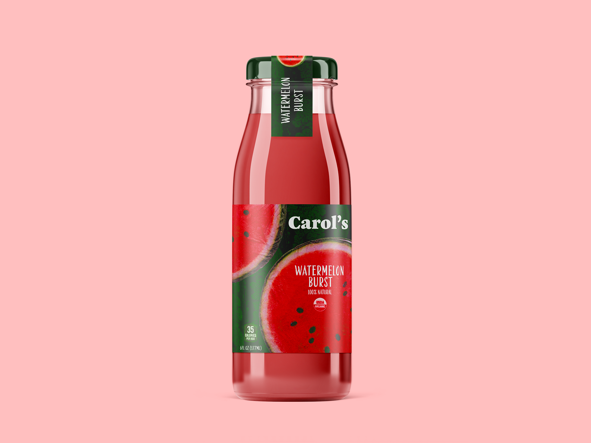
The concept Carol's Watermelon Burst centers around capturing the essence of summer and the refreshing nature of watermelon through a vibrant design. The packaging features bold colors and playful graphics that evoke a sense of fun and enjoyment. Illustrative elements of watermelons and dynamic patterns create a lively feel, making the product instantly recognizable and appealing. The overall design is intended to convey freshness and naturalness while inviting consumers to indulge in a delicious, thirst-quenching experience with Carol’s Juice.
The concept for Nadine's Mango Explosion centers around capturing the essence of tropical delight and summer enjoyment with a lively design. The packaging features bold, bright colors complemented by playful splashes of mango juice that create a sense of movement and freshness. Fun typography enhances the playful feel, while imagery of mangoes reinforces the flavor focus. Overall, the design aims to convey that each scoop of Nadine's Mango Ice Cream is a refreshing, joyful experience, inviting consumers to indulge and enjoy a sweet escape.

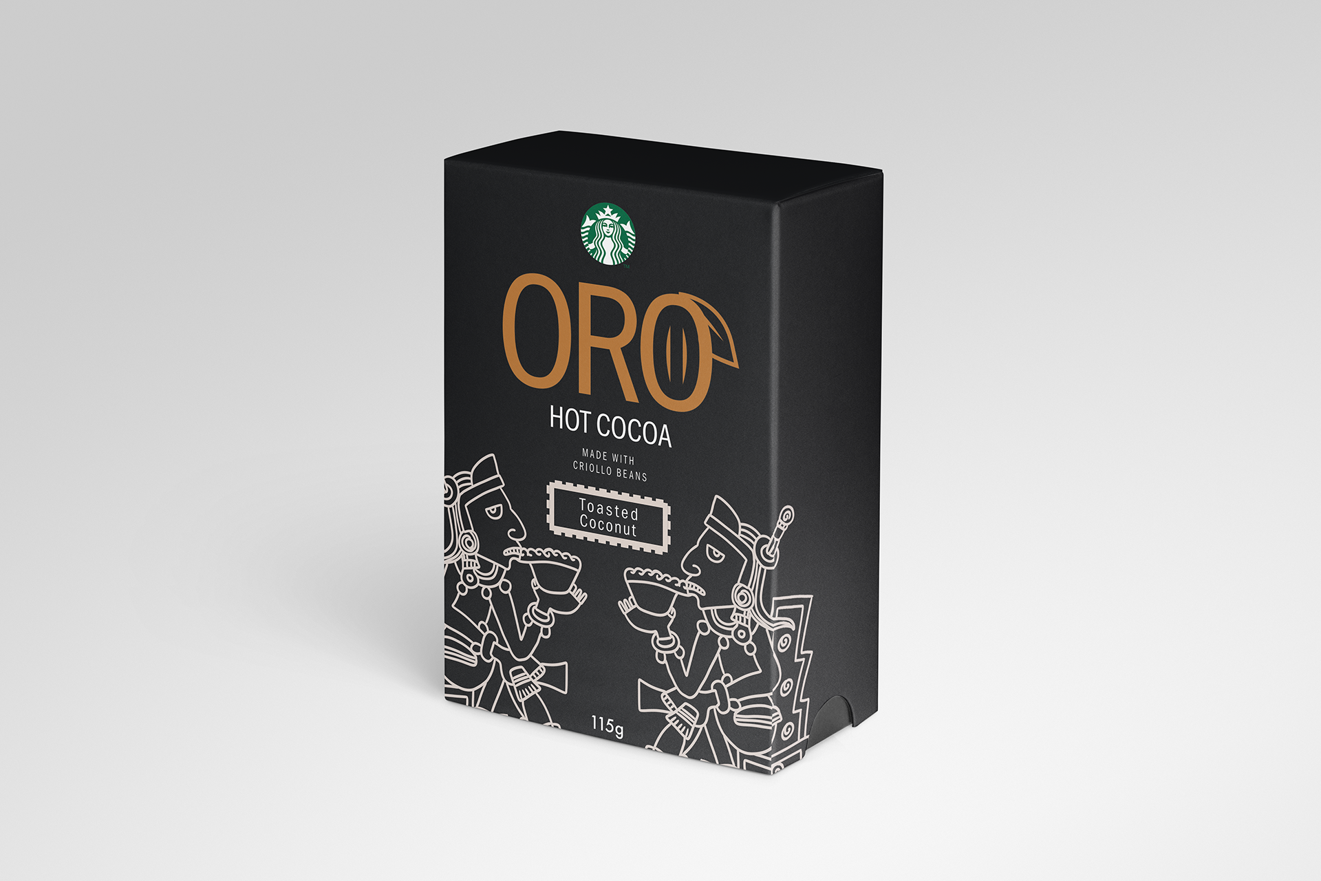

The concept of Oro Hot Cocoa revolves around capturing the essence of warmth and indulgence associated with hot chocolate. The packaging features vibrant illustrations that represent each flavor, featuring aztecs repesenting the origin of Chocolate. The design combines elegant typography with playful visuals, reinforcing the premium nature of Oro Hot Chocolate, while the affiliation with Starbucks is highlighted to enhance brand appeal. Overall, the design aims to create an inviting and delightful experience that encourages consumers to indulge in the comforting pleasure of Oro Hot Chocolate.


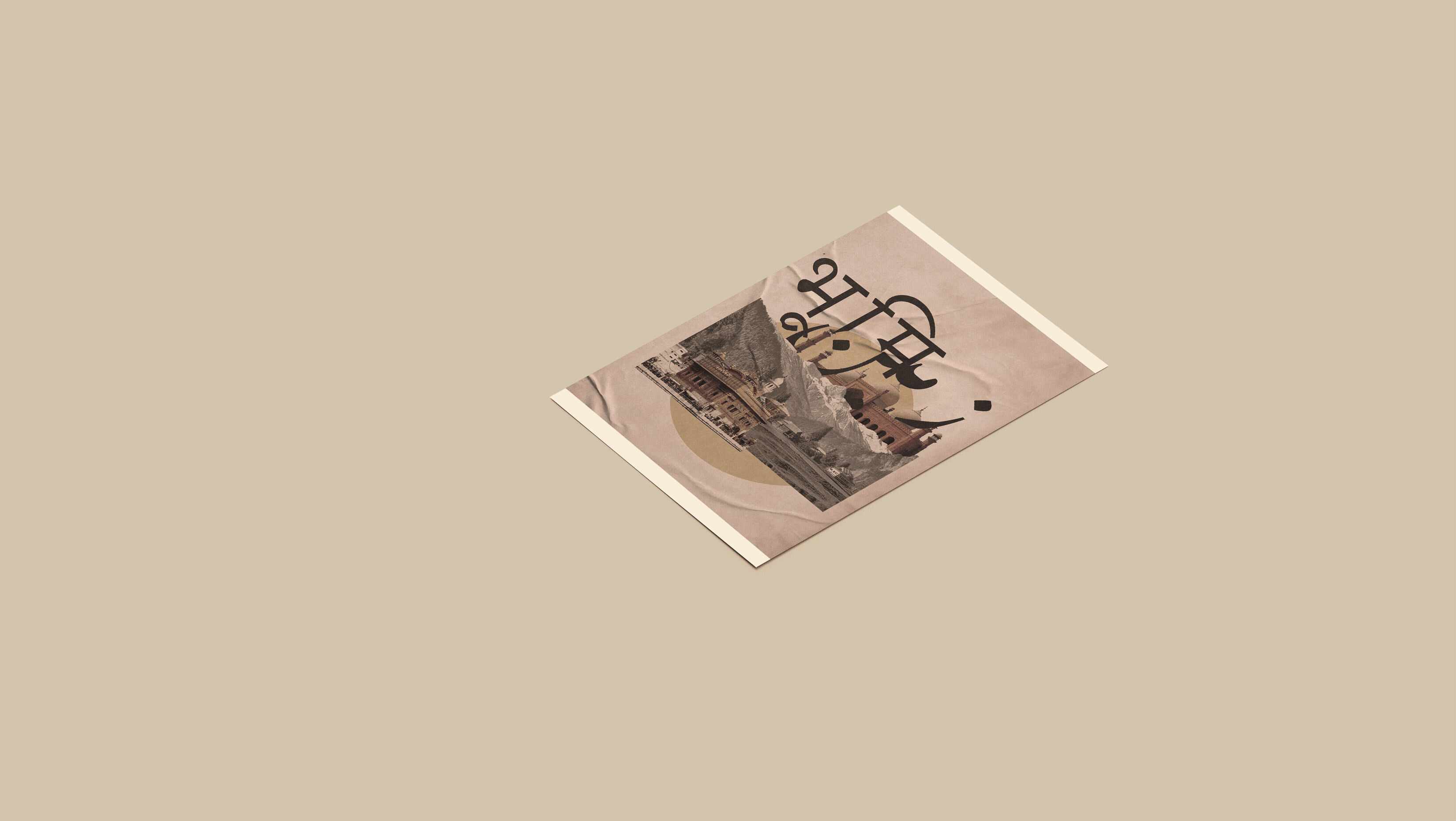
The concept emphasizes the adventurous spirit of Storm Canadian Whiskey. The packaging features a bold and elegant design, incorporating strong typography and mute colors that reflect the whiskey's depth and complexity.
The logo includes a motif inspired inspired by the Canadian landscape, reinforcing the brand's origin and authenticity. The overall design aims to create an impression of craftsmanship and quality, inviting consumers to savor the rich experience that Storm Canadian Whiskey offers, while also fostering a sense of pride in enjoying a true Canadian product.
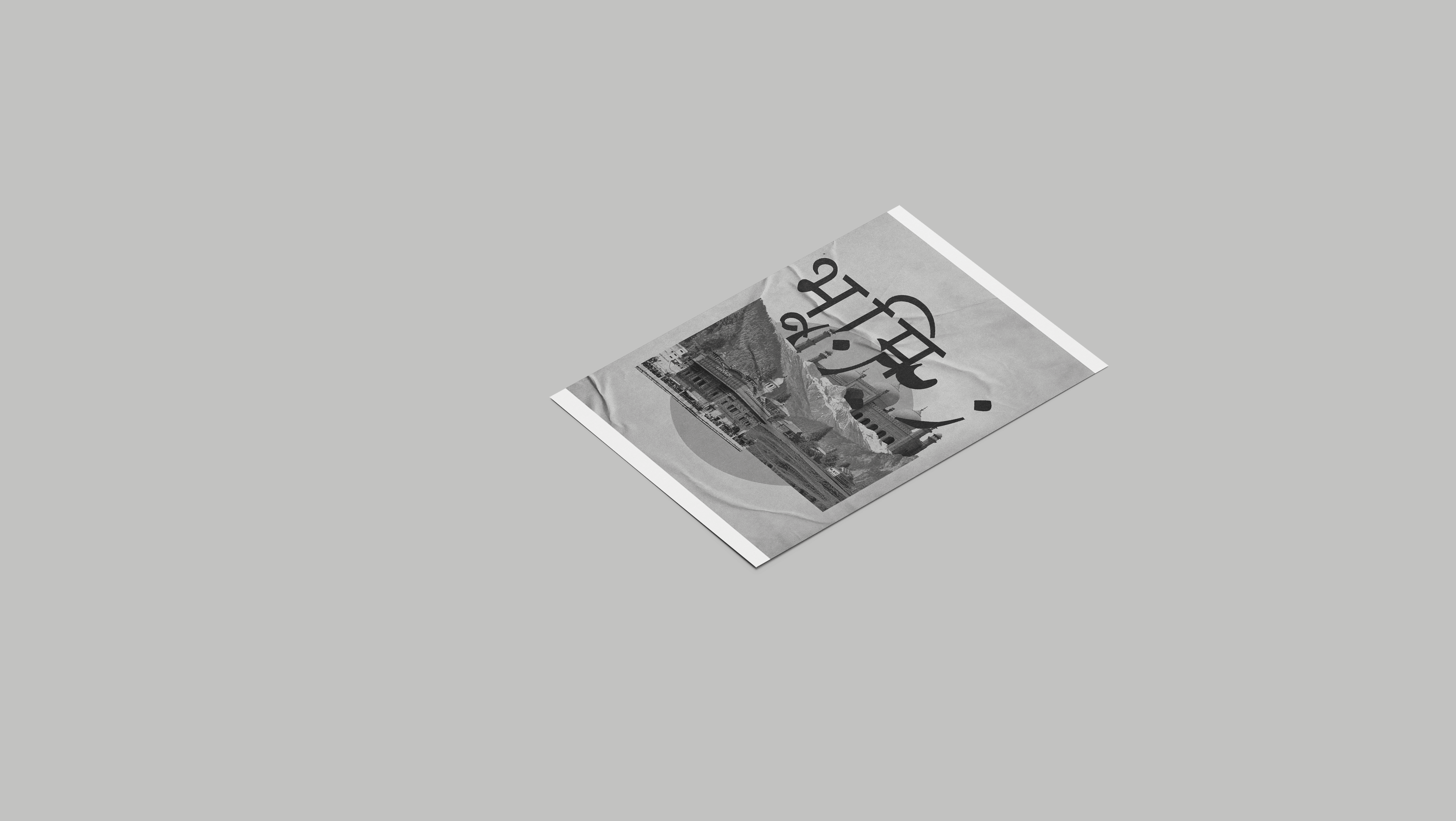
The logo includes a motif inspired inspired by the Canadian landscape, reinforcing the brand's origin and authenticity. The overall design aims to create an impression of craftsmanship and quality, inviting consumers to savor the rich experience that Storm Canadian Whiskey offers, while also fostering a sense of pride in enjoying a true Canadian product.